This post discusses the Principal component analysis (PCA) dimension reduction technique and demonstrates its application in treasury yield curve analysis.
Introduction
Principal component analysis (PCA) rotates original dataset in such a way that the rotated dateaset is orthogonal and best represents the data variations. Then it becomes a dimension reduction technique by taking first few variables in the rotated dataset. That is, denote \(X \in R^{n \times p}\) be the original dataset, and let \(W \in R^{p \times p}\) be the rotation operator, then the new dataset is
\[ T=XW \;\; or \;\; T_L= XW_L \]
where \(W_L \in R^{p \times l}\) keeps the first \(L\) components of \(W\) according to their eigenvalues. \(W\) is the eigenvectors of covariance matrrix \(X^TX\) and usually obtained by performing SVD decomposition on \(X\) directly.
\[ X=U\Sigma W^T \Rightarrow X^TX=W\Sigma^2W^T \]
In this post we apply PCA to USD treasury curves. Treasury curves are known to be correlated, and first three principal components, namely, level, spread, and fly, explain most of the curve variations. The notebook can be found here.
Treasury Curves
First let's download the constant maturity Treasury curves and look at their correlations.

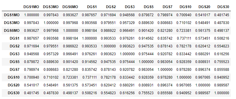
The rates are in general highly correlated; and as tenor points become further apart, the correlation decreases.
1 | from sklearn.decomposition import PCA |

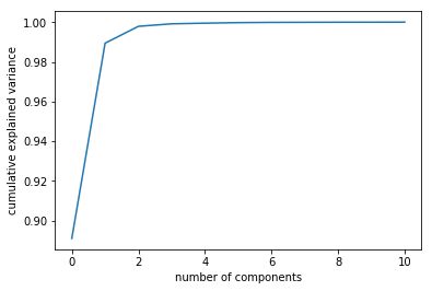
The first three principal components explained almost \(99\%\) of the total variance.
Next, let's look at the loadings or eigenvectors. It shows how the principal components are constructed from the original rates.
1 | tenors_label = ['1M', '3M', '6M', '1Y', '2Y', '3Y', '5Y', '7Y', '10Y', '20Y', '30Y'] |

From the graph, it is easy to see that the first pc is level shift; the second pc is spread; and the third pc is butterfly.
If we dont' want to trade on the exact portfolio, it's possible to construct an approximate trade. For example on the spread trade, we can choose 3M-10Y*2 as the approximate to the loadings.

Notice that the curves on the left resemble each other. If we expect the curve will start steepening soon, we can short the spread by holding 10Y twice of the duration neutral amount.
DISCLAIMER: This post is for the purpose of research and backtest only. The author doesn't promise any future profits and doesn't take responsibility for any trading losses.